
Roundtable: How Wayfinding Shapes the Office Campus Experience
Experts discuss how physical and digital wayfinding can make large, mixed-use office campuses easier to navigate without creating visual clutter.
At Ballantyne in south Charlotte, N.C., the daily flow of people extends beyond its office buildings. The 535-acre campus encompasses 39 Class A office buildings, four hotels, more than 100 dining and retail options and 240 acres of green space. Considering the number of mixed-use spaces, navigating the campus has become increasingly complex.
The same challenge is emerging at other large office properties where owners are adding coworking, retail, hospitality, event space and outdoor amenities. Each component creates additional entrances, routes and choices, making the arrival experience an important part of how the broader campus functions.
Therefore, wayfinding begins long before someone enters a building and continues through parking, pedestrian paths and common areas. Digital signs provide timely updates on events, transportation and building access, while permanent markers, architecture, landscaping and consistent naming help visitors navigate the campus without overwhelming the environment.
To examine how these systems work and come together, we’ve spoken with Julie Maggos, senior director of experiential design & principal at IA Interior Architects; Gretchen Bustillos, senior associate & design director at Gensler; Sarah Doriani, principal & design leader at Lamar Johnson Collaborative; and Clifton Coble, senior vice president of development at Northwood Office, which owns and manages Ballantyne.
Drawing on their experience in design, workplace interiors and campus development, they examine how signage can support different user journeys, where digital tools add value and why successful wayfinding begins during the planning process.
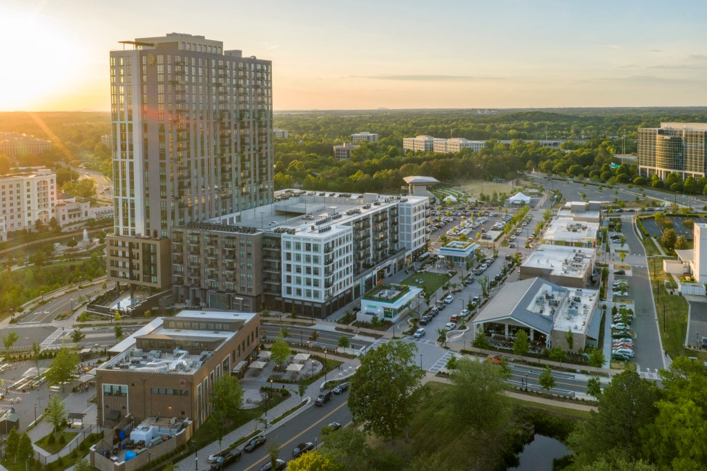
Image by Ian Bailes, courtesy of Northwood Office
What makes wayfinding more complex on large office campuses than in a traditional office building?

Image courtesy of Gensler
Bustillos: A typical office building has a consistent floorplate, so the path is more straightforward: from entry point to directory or elevator, then to the floor and suite. By contrast, an office campus breaks that simple journey apart. There are multiple buildings, entrances, parking lots, pedestrian paths and destinations, along with diverse user groups. The challenge is helping people build a mental map of the campus, so they feel confident moving throughout.
Doriani: In my practice, I always start by studying human behavior. Good wayfinding anticipates what the people moving through your space need in that moment. I consider whether they are arriving by car or on foot, as that distinction dictates the signage and guidance you provide. On a large campus, you’re solving that puzzle on a much bigger scale, and there are many more of those moments to address.
Coble: A mixed-use campus like Ballantyne supports countless multimodal visits every day, serving a variety of purposes. People may be headed to an office, restaurant, hotel, meeting, event, concert or one of our signature green spaces. We looked at wayfinding campus-wide, studying both vehicular and pedestrian circulation to understand how people naturally move through the campus and spot places where we could improve things.
How should a wayfinding system accommodate offices, coworking, retail, events and outdoor spaces within the same campus?

Image courtesy of IA Interior Architects
Maggos: Mixed-use campuses need a flexible hierarchy. Not every user needs the same information and not every message should have the same visual weight. Someone arriving for an office meeting, a coworking member, a retail customer, an event attendee and an employee moving between buildings may all be using the same campus in different ways. The signage system must support each of those journeys without overwhelming the environment.
That means distinguishing among permanent, changeable and experience-enhancing information. Permanent signage creates the bones of the campus: building names, parking, entries, circulation and major destinations. Digital or changeable signage can then support more dynamic content, such as events, temporary closures, hours, food offerings, meeting locations or seasonal programming.
Bustillos: The best signage systems create a common language across a campus, regardless of the user or their needs. Hierarchy is essential to creating a consistent framework so people can better understand where they are and how they relate to key destinations. Landscaping, architecture, lighting and other landmarks can also create intuitive cues that guide people in the right direction without overloading the environment with signs.
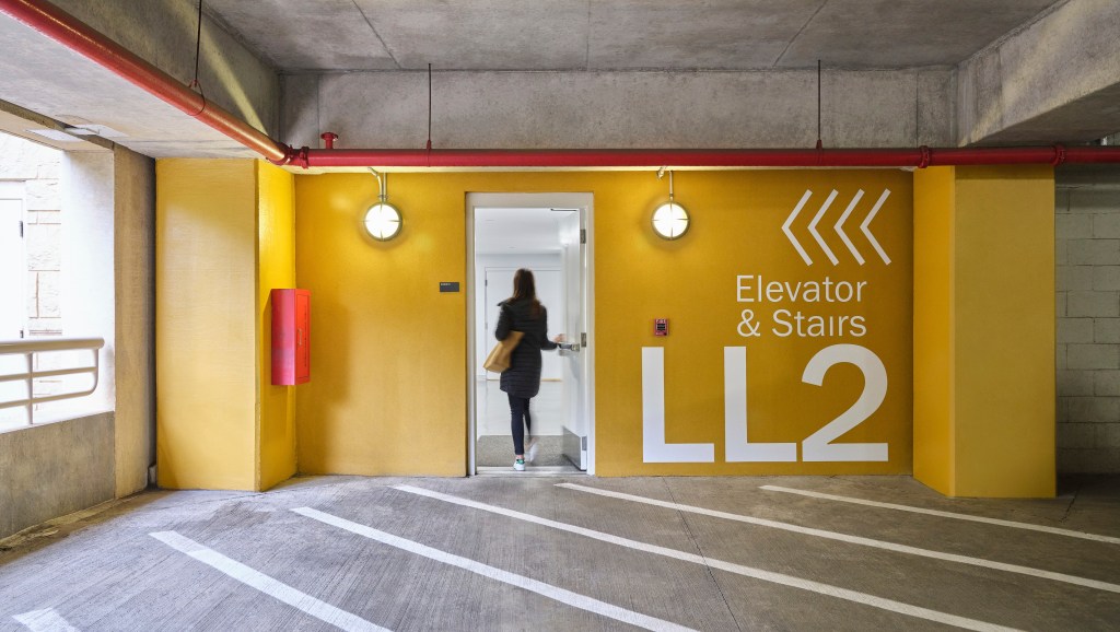
Image courtesy of IA Interior Architects
What should digital signage do beyond helping people find their way?

Image courtesy of LJC
Doriani: Digital signage should be responsive to what’s happening right now. I always ask: Where in this space do we need something dynamic and where should elements stay fixed and permanent? The static signage—stairs, elevators, restrooms, exits—should stay constant, dependable and easy to find without a second thought. Digital’s real purpose is to engage people in real time, not just point them in a direction.
Maggos: Digital signage can do more than point people somewhere. It can help with orientation, communication, brand, hospitality and day-to-day operations. For an office campus, that might mean sharing information that changes throughout the day or week: amenities, events, workplace protocols, shuttle routes, food service, meeting locations, safety updates or changes in building access.
Unlike static signage, digital signage can respond to context. It can give people what they need to know, where and when they need to know it. The key is to be intentional. Digital signage should not become a place to push every possible message. It should remove confusion, reinforce the character of the campus and help people feel like they know where they are and what’s happening.
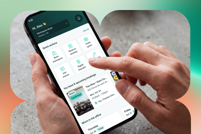
Coble: While digital signage enhances the workplace experience, it is just one component of wayfinding. As part of our efforts at Ballantyne, we’ve kept our campus wayfinding primarily physical and timeless, with digital signage concentrated in building lobbies, where content naturally changes. For broader campus communication, our goBallantyne app delivers timely updates about events, programming and other information directly to tenants.
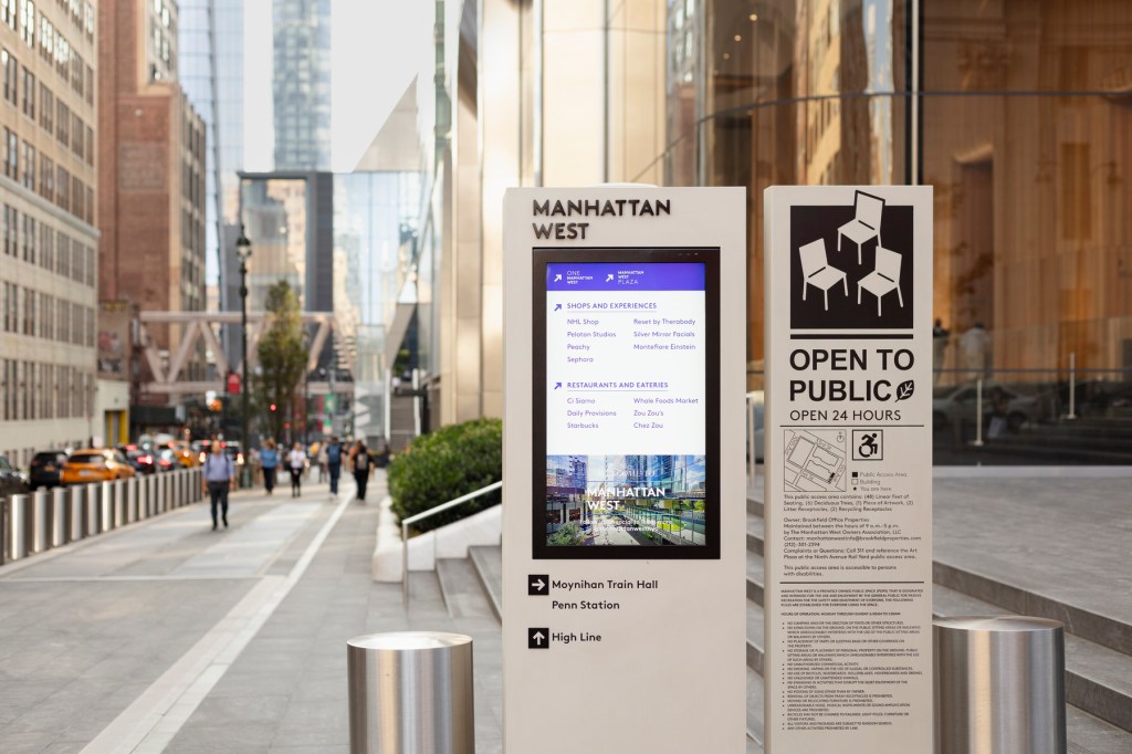
Image by Robert Deitchler, courtesy of Gensler
How can landlords create an intuitive arrival and navigation experience for first-time visitors?

Image courtesy of Northwood Office
Coble: Architecture, streetscapes, landscaping and sightlines all help orient people naturally before signage ever comes into play. By studying both pedestrian and vehicular circulation during planning, we were able to place information where people need it. When additional information is helpful, digital tools complement the physical experience without cluttering the campus.
Maggos: First-time visitors should be able to understand the logic of a campus quickly: how buildings are named, where parking belongs, where they enter, and how to move from one point to the next. The language used in pre-arrival communications, maps, parking signs, pedestrian signs, lobby directories and digital tools should all match. If a visitor receives one building name in an email, sees another on a map and a third on a sign, the system breaks down.
Good wayfinding does not need to repeat everything everywhere. It should provide the right level of information at the right moment: confirmation when someone is on the correct path, direction when they need to make a choice, and identification when they arrive.
Doriani: Signage belongs at the major decision points. It should start with something highly visible right at the entry, such as a simple map that clearly identifies buildings, destinations and routes so someone can orient themselves immediately. From there, you place additional signage at each subsequent decision point along their path.
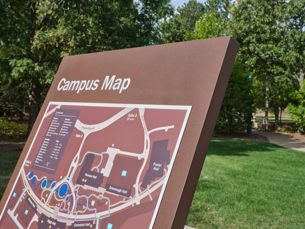
Image courtesy of IA Interior Architects
What distinguishes effective wayfinding from signage that creates visual clutter?
Bustillos: The best wayfinding anticipates decisions. Signage is not needed everywhere, only where someone has to make a choice. Information should be shared in small, manageable pieces rather than all at once. Good wayfinding systems also work with the environment, integrating lighting, landmarks and architecture alongside static information.
Maggos: Good wayfinding reduces cognitive load. Visual clutter adds to it. A good system asks: Where does someone need to make a choice? What do they already know? What do they need to know next? What can wait until later? Poor wayfinding often comes from trying to answer every possible question everywhere, which creates too many signs, too much text and too little hierarchy.
Strong wayfinding is also consistent. It uses a clear naming system, predictable placement, legible typography, intuitive maps, recognizable landmarks and a restrained graphic language. The best systems often feel almost invisible because they give people confidence before confusion sets in.
Doriani: The biggest mistake is offering too much information too soon. Good wayfinding narrows the field to exactly what a person is searching for in that moment and delivers that information without requiring them to stop. Ideally, you can absorb what you need while still moving, without breaking stride. Effective wayfinding pulls a space together. It should echo the interior materials, the color palette and the brand so it feels like an extension of the space itself.
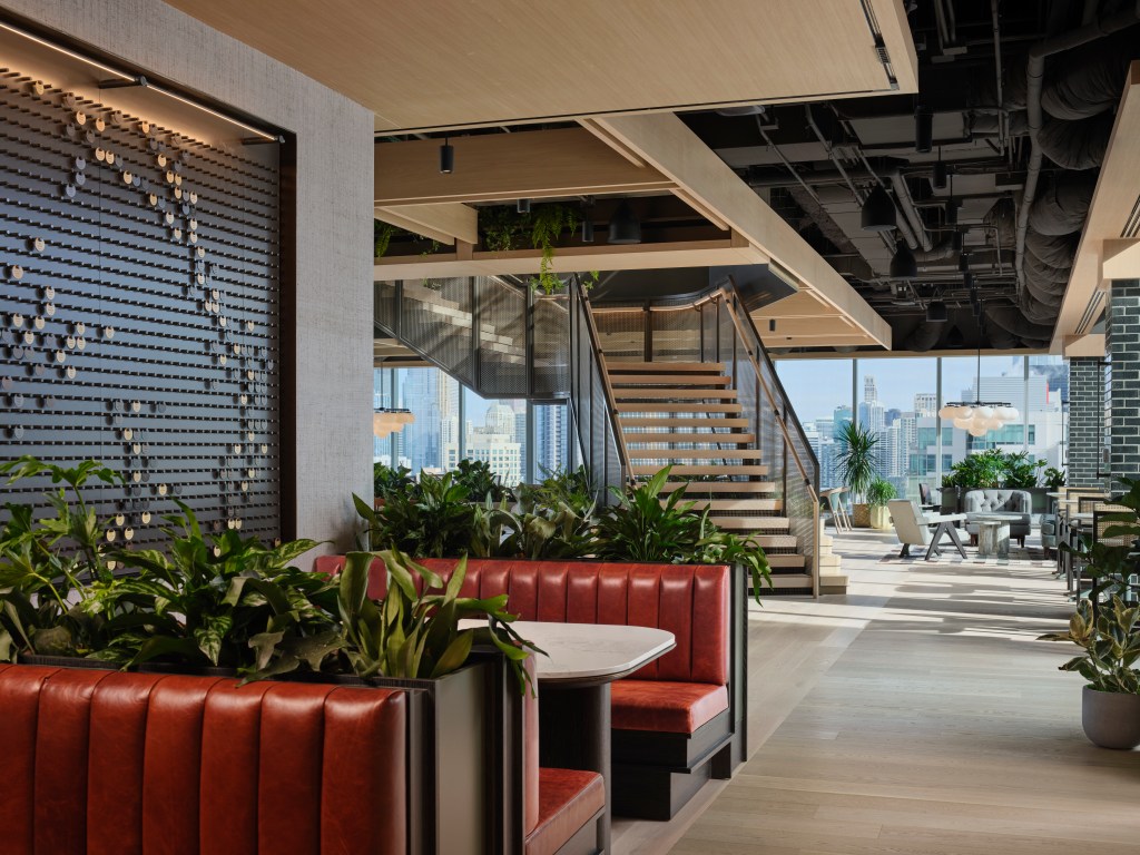
Image by Steve Hall, courtesy of LJC
Where do landlords and operators still miss opportunities when it comes to signage, navigation and the arrival experience?
Maggos: Landlords and operators often miss the opportunity to treat signage as part of a broader commitment to accessibility, sustainability and belonging. Too often, accessibility is approached as a compliance exercise—meeting ADA requirements, but not necessarily creating an experience that feels intuitive and independent for a wide range of users.
True accessibility goes further. It considers people with visual, physical, auditory and cognitive differences, as well as visitors with different levels of familiarity with the site. That means designing wayfinding systems with multiple modes of communication: clear visual hierarchy, tactile cues and maps, Braille, raised lettering, landmarks, environmental cues and consistent information at key decision points.
Bustillos: Treating wayfinding systems as something layered on at the end of a project can create significant challenges. Confusing parking or an entrance that is hard to find can detract from an otherwise well-designed experience. A good system can also help people discover campus amenities and activities, making the site feel more welcoming and active.
Doriani: The best wayfinding is woven into space during the design phase, so it feels cohesive and part of both the space and the brand. In a coworking environment, for example, a front desk that isn’t positioned right at the entry means the people working there may be constantly interrupted by visitors asking for directions. Eventually, people will stop using that space altogether. When wayfinding works, people don’t notice it. When it doesn’t, everyone feels it.
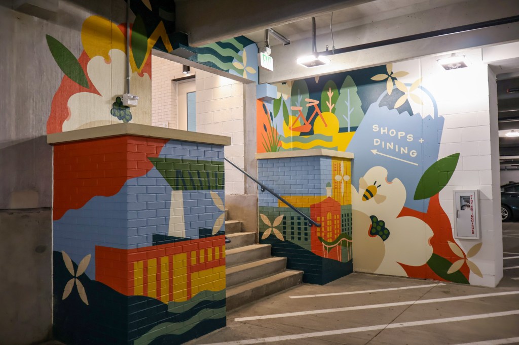
Image courtesy of Northwood Office

Olivia Bunescu
View more from
Bunescu